Case study 02 · Fashion e-commerce
Luxora: redefining luxury fashion online
A luxury brand with a frustrating, generic digital experience. A full-cycle redesign — from research to launch — to make discovering, exploring and buying premium fashion feel as refined as the products themselves.
A premium brand, a cheap-feeling experience
Users struggled to find products, lost confidence in the checkout flow, and found the experience cold and overwhelming. Cluttered navigation, poor visual hierarchy and no product storytelling drove high bounce and abandonment — contradicting the brand’s premium identity.
Task completion
Users couldn’t complete basic flows without help.
Cart abandonment
Checkout confusion was the number-one exit trigger.
Navigation satisfaction
Out of 5 — browsing felt unintuitive.
Design a seamless, emotionally resonant shopping experience that communicates luxury, builds trust through the purchase journey, removes friction at every touchpoint, and lifts conversion and satisfaction — while staying true to the brand.
- 01EmpathizeInterviews, surveys, competitive analysis
- 02DefinePersonas, journey maps, HMW statements
- 03IdeateIA, user flows, sketches, card sorting
- 04PrototypeWireframes, hi-fi, design system
- 05TestUsability testing, iteration, handoff
Research that drives design
We combined in-depth interviews with 24 participants, 100+ survey responses, 8 competitor analyses and analytics from 5,000+ shoppers — over 120 research hours in total.
What people told us
- Personalisation is king. Users overwhelmingly preferred tailored recommendations to generic listings.
- Visual discovery matters. 70% wanted visual search and virtual try-on to buy with confidence.
- Shopping is emotional. Mood, occasion and gifting heavily shape behaviour.
- Community builds trust. Many look for trend discovery and social proof before buying.
- Speed and simplicity. Complex checkouts lead to immediate abandonment.
AI-powered personalisation is essential, not optional. Visual search addresses the core discovery pain. Community features build trust and drive retention.
Meet Sarah Johnson
Sarah Johnson
Marketing executive · 32 · San Francisco
“If the website feels cheap, I assume the clothes are too.”
Goals
- Find trend-forward items quickly
- Get personalised recommendations
- Shop efficiently in limited time
Frustrations
- Overwhelming choice without context
- Recommendations that miss her style
- Unsure how items will fit
- Slow checkouts
Motivations
- Expressing personal style
- Staying ahead of trends
- Finding thoughtful gifts
Four journeys from one entry point
Every major feature maps to a journey that starts at the same place — Explore — and ends in the cart or at checkout.
AI visual search
- Upload photoCamera or gallery
- AI analysisPattern recognition
- Match resultsSimilarity %
- Product detailsView & compare
- Add to cart
AI gift finder
- Recipient infoAge, interests
- OccasionBirthday, holiday
- BudgetPrice range
- AI suggestionsMatch score
- Gift wrap & add
Community trends
- Trends entryLocal, national, influencer
- Filter & sortCategory, price
- Explore productsSocial proof
- Save or buy
Complete purchase
- Review cartEdit items
- CheckValid?Stock, address, totals
- Shipping infoAddress autocomplete
- PaymentSecure checkout
- SuccessOrder placedEmail sent, tracking active
- New in
- This week
- Trending now
- Editor’s pick
- Women
- Clothing
- Shoes
- Accessories
- Men
- Clothing
- Shoes
- Accessories
- Designers
- A–Z browse
- Spotlight
- Collabs
- Sale
- Up to 30%
- Up to 50%
- Final sale
The design system in action
Restrained, editorial layouts let product imagery lead. Orange is the primary action colour, pink the accent, purple adds depth. Every hover, transition and micro-animation has a job: confirm an action, guide attention, or build trust.
Home & landing
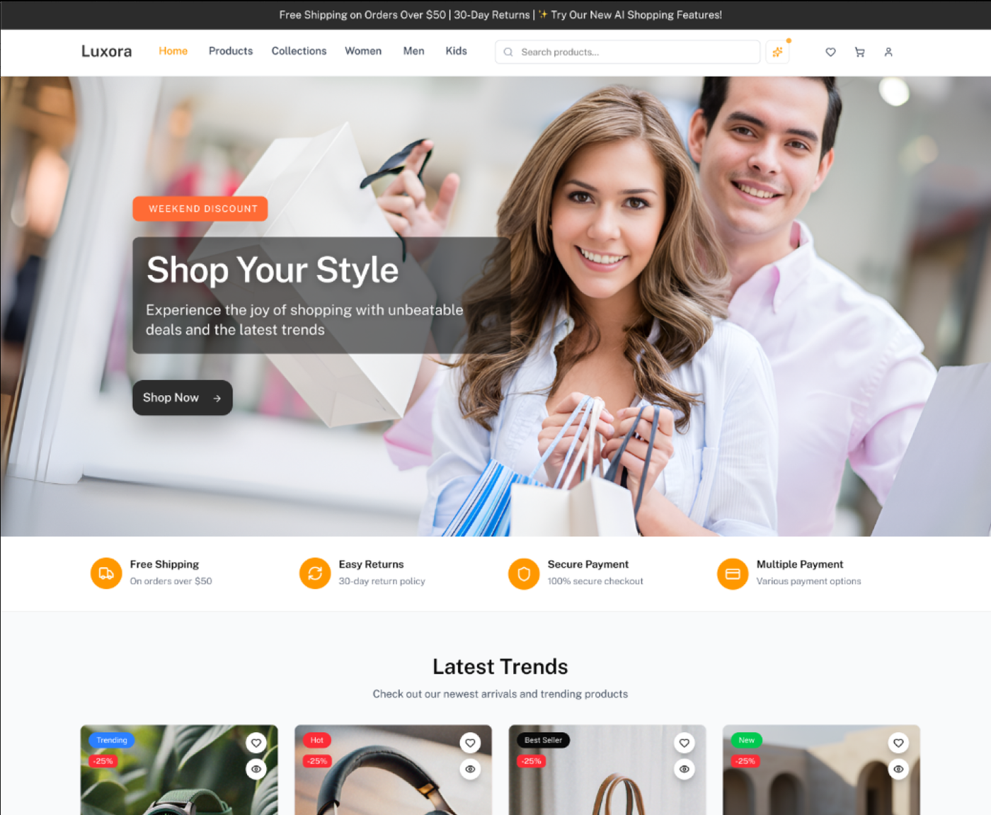
An editorial hero with a single dominant CTA, a hand-curated grid instead of algorithmic clutter, and a 5-category mega-menu with no nested dropdowns.
Product listing
Sticky filter sidebar on desktop, slide-up drawer on mobile, instant updates. Name, price and wishlist visible without hovering.
Product detail
A persistent “Add to bag”, an inline size guide and trust signals — free returns, next-day delivery, secure payment — at the point of decision.
Checkout & account
From 8 steps to 3: details, delivery, payment. Guest checkout first, account creation after purchase, persistent order summary.
AI shopping features
Visual search, the gift finder and “Design your look” virtual try-on — mobile-first with 44px tap targets and progressive disclosure.
Type scale
Playfair Display for editorial headings, DM Sans for UI, DM Mono for prices and data.
#FF9600#DC2577#9912F3#019865#2C2C2EThe transformation
Before
- Six competing CTAs on the homepage
- Flat navigation, no visual categories
- No persistent filters on listings
- No size guides or styling suggestions
- 8-step checkout with forced sign-up
- Mobile was a shrunk desktop layout
After
- One clear CTA per section
- Visual mega-menu with quick links
- Sticky sidebar filters, drawer on mobile
- Size guide, care info and styling tips
- 3-step guest checkout
- Mobile-first components, 44px targets
Validated by real users
Two rounds of moderated testing with 8 participants each — one on prototypes, one on the staging build — with success metrics defined upfront.
Task completion
Navigation clarity
Net Promoter Score
“Finally — a luxury site that actually feels luxurious. I found what I wanted in under a minute and the checkout was painless.”
Participant 3 · 32, marketing executive“The size guide is exactly what I needed. I’ve never felt confident buying shoes online before.”
Participant 6 · 28, brand managerResults that speak
Three months after launch, the redesigned platform improved every key business and experience metric.
Before
After
Conversion rate, driven by the streamlined checkout and richer product pages.
Mobile session duration — people now browse longer on their phones.
Cart abandonment after the simplified 3-step guest checkout.
What I discovered
Trust is earned through detail
Luxury shoppers read quality from typography, image quality, copy and micro-interactions. Generic patterns signal “cheap”.
Research reveals the unexpected
We assumed desktop was primary. Research showed most browsing was mobile, which changed the design priorities and budget.
Friction compounds across a journey
Small pain points feel minor alone; across six steps they make the whole experience exhausting. Every step saved counts.
Iteration beats perfection
Two rounds of testing caught issues that would have cost far more to fix after launch.